In this first installment of a new blog series on the research applications of mapping and geospatial analysis tools, Resources for the Future scholar Alexandra Thompson examines the useful role of geographic information systems (GIS) for interpreting how the Inflation Reduction Act defines “energy communities.”
Today is GIS Day, a good time to explore and celebrate geographic information systems (GIS) in our work and in our lives. Resources for the Future (RFF) is celebrating GIS Day with the launch of a new blog series. Throughout the series, we’ll explore the role of GIS in our research and what makes GIS an exciting and productive tool.
GIS allows researchers to store and analyze geographic data—in other words, data associated with locations. Differentiating among locations is important for policymakers because communities are not all the same—their people, environment, natural resources, economy, history, infrastructure, and administration weave a diverse tapestry across the country and world. To move toward a net-zero economy in a just and strategic way, efforts to facilitate energy transitions must take these differences into account. One-size-fits-all economic policies would be less effective.
The Inflation Reduction Act (IRA), a significant climate bill that was signed into law this year, incorporates this wisdom about diverse communities. The law takes an approach that bases financial incentives for clean energy on the intensity of local reliance on energy industries: the more a community depends on its local energy industry for jobs, income, and tax revenue, then the more that community is likely to benefit from the financial incentives. This geographic targeting allows administrators of the incentives in the IRA to identify and focus on these communities, which the IRA dubs “energy communities,” as opportunities for a resilient transition to a less carbon-intensive economy.
Eligibility for the financial incentives in the IRA is geographically based on these energy communities. Hence, maps and mapping tools likely will be instrumental to the process through which administrators dole out the funds to communities. Researchers at RFF already have employed such mapping tools for these determinations. In a recent report, RFF scholars Daniel Raimi and Sophie Pesek used a range of GIS tools to explore how different definitions of “energy community” affect the spatial distribution of benefits.
The Role of GIS in Mapping Energy Communities
GIS was essential for this analysis,” says Pesek. “Almost all of our results were derived from GIS calculations.” Using GIS, Pesek and Raimi could compare among different—but standardized—geographic units, like counties, tracts, and metropolitan statistical areas. They made calculations with GIS tools to determine the places that are covered under each IRA provision; for example, GIS enabled the researchers to identify counties near coal mines that had closed and calculate their land area and populations. These calculations were necessary for their research, because census tracts that are adjacent to tracts with closed coal mines also are eligible for the financial incentives in the IRA.
Raimi and Pesek’s analysis required meticulous data collection and precise execution of GIS tools. To ensure transparency, accuracy, and flexibility, the researchers ensured that their methods are reproducible. “We put all the code and data up online, so people could analyze the data to assess whether their particular geographies of interest would be eligible under our different interpretations of the law,” says Raimi.
Counties with high fossil fuel employment usually are adjacent to counties with similarly high levels of fossil fuel employment. These nuanced local realities are pertinent to constructing policies that can support a transition to clean energy.
Raimi and Pesek could have used tables, spreadsheets, or listed information to collect, sort, and analyze the data associated with the different definitions of “energy community.” But a table or list that shows which counties would qualify for incentives under alternative specifications of an “energy community” would be insufficient for scrutinizing potential outcomes and impacts on eligible communities. Working with GIS, however, allowed for intuitive visualizations of the data, which simplified and more clearly communicated multifaceted results.
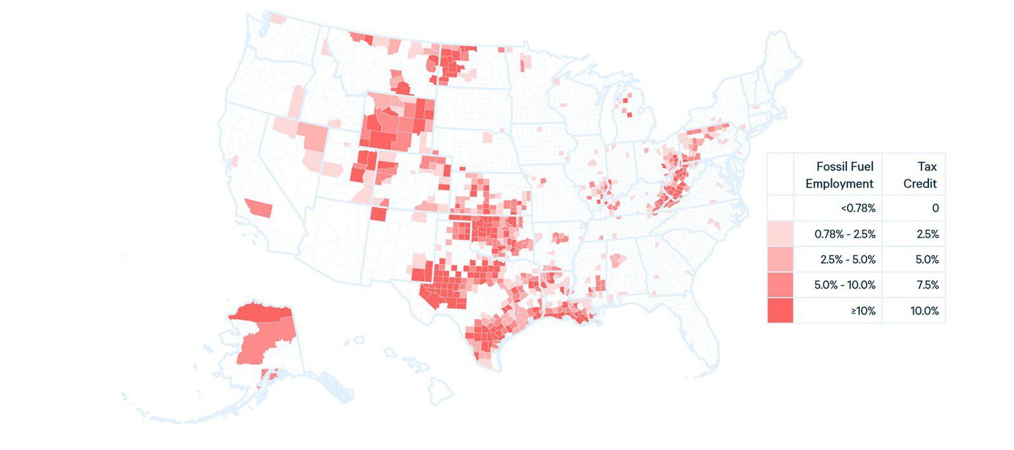
The maps in the report illustrate this clarity. A major distinction between the definition of an “energy community” in the IRA and the alternative definitions developed in the RFF report is whether qualification for eligibility is binary or scaled. In other words, under the definition in the IRA, a community is either eligible for an incentive or ineligible (binary); however, the RFF report suggests that, depending on certain criteria, a community could be eligible for a range of incentives (scaled), such as higher or lower tax credits. So, instead of visualizing eligibility based on binary criteria (as the IRA definition would require), Pesek and Raimi produced maps to show the range of eligibility included in their definition. Color coding with a gradient, for example, enables us to examine the underlying criteria and scaled data more precisely and holistically than a binary “in or out” map (Figure 1).
Figure 1. Counties Eligible as “Energy Communities” Based on Fossil Fuel Employment, According to a Scaled Definition of Eligibility

Data sources: US Census Bureau (2022a) for employment thresholds. BLS (2022) for unemployment thresholds.
Figure 1 indicates that energy communities are not confined to county boundaries. Counties with high fossil fuel employment usually are adjacent to counties with similarly high levels of fossil fuel employment. These nuanced local realities are pertinent to constructing policies that can support a transition to clean energy.
What Maps Give Us
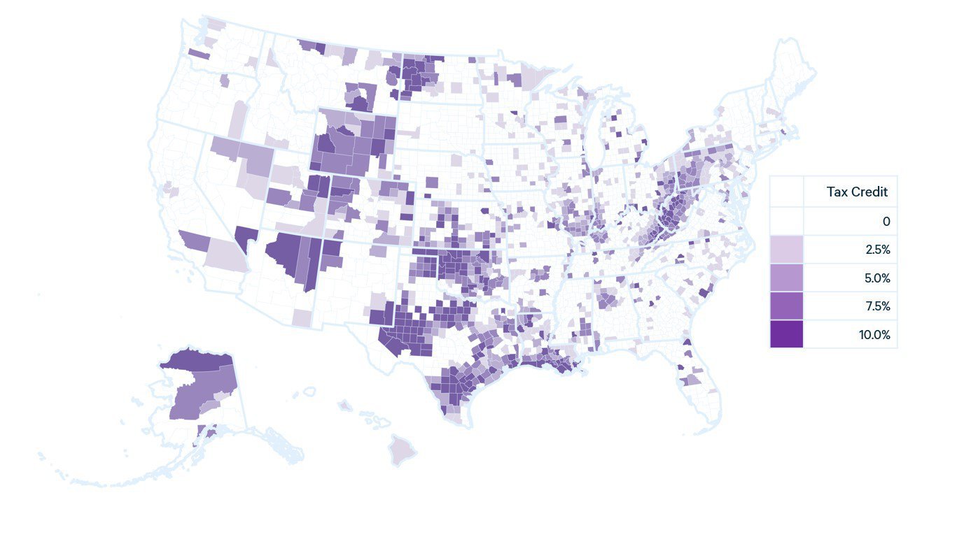
These maps of eligibility portray the local realities especially well. Take Figures 2 and 3 below: these maps translate policy from complicated text and numbers into information that we can interpret quickly.
Figure 2. Areas Eligible for a 10 Percent Credit for Clean-Energy Projects, According to the Central Interpretation of the Inflation Reduction Act

Figure 3. Counties Eligible for Financial Incentives in the Inflation Reduction Act, According to the Definition of “Energy Communities” in the Recent Report by Raimi and Pesek

These visualizations were essential for drawing conclusions about the provisions as stated in the IRA. “Looking at the maps, we observed quite a bit of spatial mismatch between the areas targeted by the IRA and the regions we would typically think of as ‘energy communities’ that are heavily dependent on fossil fuels for local jobs, economic activity, and government revenue,” Raimi says.
When we use maps to compare policy scenarios, our eyes are drawn to the similarities, differences, clusters, spatial patterns, and blank spaces. We can mentally add our own “data layers” to the areas we know from past research, personal experience, or news headlines. Perhaps, too, we can imagine the people and landscapes that are represented by the two-dimensional swathes of color. The cluster of eligible energy communities that spans Tennessee to Pennsylvania, for example, might bring to mind community solar projects in the valleys of Appalachia.
GIS applications, like the ones Raimi and Pesek used to create these maps, help us translate data into visual information and can bring us one step closer (or more!) to understanding how policy scenarios and decisions might impact communities that will be affected by the energy transition.


